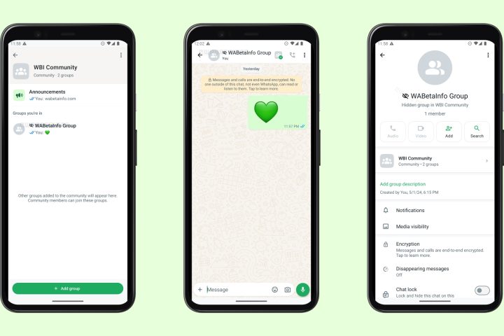
WhatsApp users continue to react to recent changes in the app’s design, especially the use of the shade of green.
Some users say that the color change irritates their eyes and that WhatsApp’s new design includes a shade of green that they don’t like. Since the change was only rolled out to select users, not all users have had the opportunity to try it out yet.
WhatsApp describes this new design as an “updated look” and notes that the changes include various elements such as spacing, colors and icons. The aim of these changes is to make the app more modern and user-friendly.
However, users are particularly uncomfortable with the choice of green. Despite WhatsApp’s statement that it has chosen a shade of green in line with its “brand color”, some users are still getting used to the change.
However, other minor changes in WhatsApp’s new design are also noteworthy. Users are also evaluating innovations such as the addition of dark mode, updating icons and buttons, and increasing spaces.
WhatsApp has stated that these changes will be implemented gradually and that all users will receive the update over time. However, while some users expect this process to be faster, they may have to wait patiently for now.


